If you’re starting your journey with React and Tailwind CSS, building simple, practical projects is a fantastic way to learn. One such project is the Mood Color Palette App using React. It’s an interactive, visually appealing application that allows users to explore color palettes based on different moods. Let’s dive into how you can create this project and understand the key concepts it covers.
What Is the Mood Color Palette App?
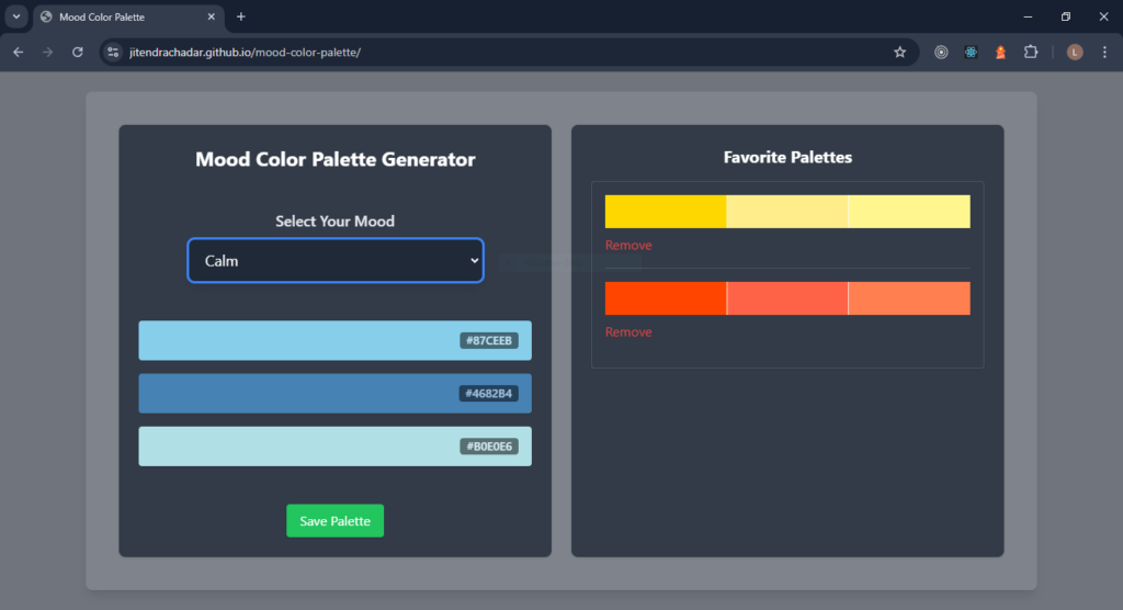
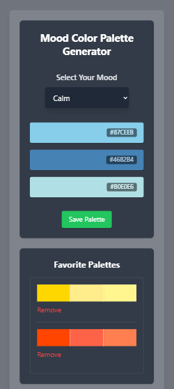
The Mood Color Palette App is a single-page React application where users select a mood (like Happy, Calm, or Energetic) and see a matching palette of colors. The app also allows users to copy individual color codes and save their favorite palettes locally.
This project is great for beginners because it:
- Teaches you how to manage state in React.
- Introduces Tailwind CSS for styling components.
- Provides practice with user interactions like button clicks and clipboard functionality.
- Encourages creative thinking by connecting moods with colors.
Key Features of the App
Here’s what the app will do:
- Display a set of moods for users to choose from.
- Show a color palette corresponding to the selected mood.
- Allow users to copy color codes to the clipboard by clicking on them.
- Provide an option to save palettes and view them later.
How the Mood Color Palette App Stands Out
Unlike static web pages, this app is dynamic and interactive. It connects emotions to colors, creating an intuitive and engaging experience. By using Tailwind CSS, you can make the app visually stunning with minimal effort. Plus, with React’s component-based structure, the app is easy to build, maintain, and expand.
What Will You Learn by Building This App?
This project is more than just a fun exercise. You’ll learn:
- React State Management: Use React’s useState hook to track user-selected moods and saved palettes.
- Tailwind CSS Basics: Apply utility classes to style your components with precision.
- Event Handling in React: Learn how to handle user interactions like button clicks.
- Clipboard API: Implement functionality to copy text programmatically.
- Local Storage: Persist user data (like saved palettes) across sessions.
Step-by-Step Breakdown of Mood Color Palette App Using React
1. Set Up the Project
Start by creating a new project with Vite. It’s fast and beginner-friendly:
npm create vite@latest mood-color-pallete --template react
cd mood-color-pallete
npm install
Next, set up Tailwind CSS by installing the required dependencies and configuring it:
npm install -D tailwindcss postcss autoprefixer
npx tailwindcss init
Add Tailwind’s directives to src/index.css:
@tailwind base;
@tailwind components;
@tailwind utilities;
2. Plan the Component Structure
Divide your app into logical components:
- MoodSelector: Displays buttons for selecting moods.
- ColorPalette: Shows the corresponding palette for the selected mood.
- FavoritePalettes: Displays saved palettes and allows users to manage them.
Each component will have a specific role, making the app modular and easier to understand.
3. Create the MoodSelector Component
This component allows users to select a mood. Here’s a basic implementation:
const MoodSelector = ({ moods, onSelectMood }) => {
  return (
    <div className="flex flex-col items-center my-4">
      <label
        htmlFor="mood-dropdown"
        className="block text-lg font-semibold text-gray-200 mb-2"
      >
        Select Your Mood
      </label>
      <select
        id="mood-dropdown"
        onChange={(e) => onSelectMood(e.target.value)}
        className="w-3/4 max-w-md bg-gray-800 text-white text-lg py-3 px-4 rounded-lg shadow-lg border border-gray-700 focus:outline-none focus:ring-2 focus:ring-blue-500 focus:border-blue-500 transition"
      >
        <option value="" disabled selected>
          Choose your Mood
        </option>
        {moods.map((mood) => (
          <option key={mood} value={mood} className="text-gray-200">
            {mood}
          </option>
        ))}
      </select>
    </div>
  );
};
Pass an array of moods (e.g., Happy, Calm, Energetic) and a callback to handle mood selection.
4. Build the ColorPalette Component
This component displays the colors for the selected mood. It also lets users copy color codes to the clipboard:
const ColorPalette = ({ palette, onCopy }) => {
  return (
    <div className="flex flex-col gap-4 my-4">
      {palette.map((color, index) => (
        <div
          key={index}
          className="flex justify-between items-center w-full h-12 rounded shadow cursor-pointer px-4"
          style={{ backgroundColor: color }}
          onClick={() => onCopy(color)}
        >
          {/* Empty spacer to make it visually balanced */}
          <span></span>
          {/* Hex Code */}
          <span className="text-white bg-black px-2 opacity-50 rounded font-semibold text-sm">{color}</span>
        </div>
      ))}
    </div>
  );
};
Use the navigator.clipboard.writeText method to copy color codes.
5. Add FavoritePalettes
The FavoritePalettes component will save and display user-selected palettes. You’ll use localStorage to persist data:
const FavoritePalettes = ({ favorites, onRemove }) => {
  return (
    <div className="p-4 border border-gray-600 rounded shadow">
      {favorites.map((palette, index) => (
        <div key={index} className="mb-4">
          <div className="flex">
            {palette.map((color, i) => (
              <div
                key={i}
                className="flex-1 h-10"
                style={{
                  backgroundColor: color,
                  borderRight: i !== palette.length - 1 ? "1px solid #ffffffd6" : "none", // Divider between colors
                }}
              ></div>
            ))}
          </div>

          <button
            onClick={() => onRemove(index)}
            className="text-red-500 mt-2 hover:underline"
          >
            Remove
          </button>

          {index !== favorites.length - 1 && (
            <hr className="my-4 border-gray-600" />
          )}
        </div>
      ))}
    </div>
  );
};
6. Bring It All Together in App.jsx
Here’s the overall structure of your app:
import { useState } from "react";
import MoodSelector from "./components/MoodSelector";
import ColorPalette from "./components/ColorPalette";
import FavoritePalettes from "./components/FavoritePalettes";

const moodPalettes = {
	Happy: ["#FFD700", "#FFEC8B", "#FFF68F"],
	Calm: ["#87CEEB", "#4682B4", "#B0E0E6"],
	Energetic: ["#FF4500", "#FF6347", "#FF7F50"],
};

function App() {
	const [selectedMood, setSelectedMood] = useState(null);
	const [favorites, setFavorites] = useState([]);

	const handleCopy = (color) => {
		navigator.clipboard.writeText(color);
		alert(`Copied ${color} to clipboard!`);
	};

	const handleSave = () => {
		if (selectedMood) {
			setFavorites([...favorites, moodPalettes[selectedMood]]);
		}
	};

	const handleRemove = (index) => {
		setFavorites(favorites.filter((_, i) => i !== index));
	};

	return (
		<div className="min-h-screen bg-gray-900 bg-opacity-60 backdrop-blur-md bg flex justify-center p-6">
			<div className="w-full max-w-6xl bg-white bg-opacity-10 rounded-lg shadow-lg p-6 md:p-10 grid grid-cols-1 md:grid-cols-2 gap-6">
				<div className="bg-gray-800 bg-opacity-80 rounded-lg shadow p-6 flex flex-col justify-between">
					<h2 className="text-2xl font-bold text-white mb-4 text-center">
						Mood Color Palette Generator
					</h2>

					<MoodSelector
						moods={Object.keys(moodPalettes)}
						onSelectMood={setSelectedMood}
					/>

					{selectedMood && (
						<ColorPalette
							palette={moodPalettes[selectedMood]}
							onCopy={handleCopy}
						/>
					)}
					<button
						onClick={handleSave}
						disabled={!selectedMood}
						className="block bg-green-500 text-white px-4 py-2 rounded shadow mx-auto mt-4 hover:bg-green-600 transition"
					>
						Save Palette
					</button>
				</div>

				<div className="bg-gray-800 bg-opacity-80 rounded-lg shadow p-6 flex flex-col">
					<h2 className="text-xl font-bold text-white mb-4 text-center">
						Favorite Palettes
					</h2>
					{favorites.length > 0 ? (
						<FavoritePalettes favorites={favorites} onRemove={handleRemove} />
					) : (
						<p className="text-gray-400 text-center">
							No favorite palettes saved yet. Add some!
						</p>
					)}
				</div>
			</div>
		</div>
	);
}

export default App;
Conclusion
The Mood Color Palette App is an excellent project for beginners to explore the power of React and Tailwind CSS. By building this app, you’ll strengthen your understanding of state management, component reusability, and styling with Tailwind.
Once you’re comfortable with this project, you can extend it by adding more moods, user-defined palettes, or even integrating an API for generating random palettes.
Want to explore further?
- Check Out the Live App: Click Here
- Browse the Source Code: GitHub Repository
Stay tuned for a step-by-step tutorial where we’ll build this app from scratch. Until then, happy coding!

